Welcome to App 4! We have spent countless hours, held many meetings and conducted extensive research to deliver a whole new, refreshed LIFX app experience.
Now, we completely understand that for some users the redesign is a big shift — but bear with us here. The thing is, as we continue to build out our smart homes the way we go about control needs to be done differently. Given this, we consider this a big shift in the right direction.
If you are reading this blog, and have absolutely no idea what we are talking about, then you may fall into one of the following categories:
- You don’t own any LIFX.
- You do not have auto-updates turned on (dw, we get it).
- You rarely (if ever) use the LIFX App and instead control your lights via another method e.g. Voice, Smart Switch.
If you fall into category 1, let’s change that. You can find our store here.
For those who fall into categories 2 & 3, I’d suggest you either get your eyes on the app or go and update immediately.
For the rest of you, I’m sure the change was quite a surprise, I mean, we haven’t done an update like this for YEARS. It was a big change for us as well, moving from the progressive functionality/bug update approach to a complete redesign. The good news is we are here and we are proud to be here.
Let’s get into it. Our Director of Design, Rachel Wilson, has offered her insight into the thought process behind App 4. You’ll see Rachel’s comments quoted throughout.
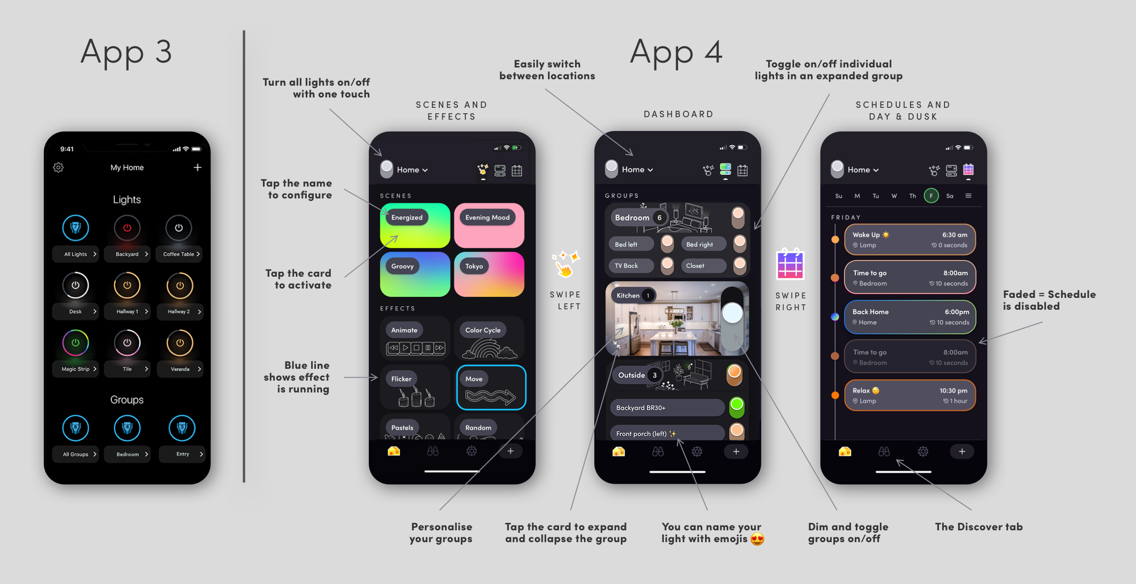
Navigation: Effects, Dash, & Schedules
App 4 is designed to be adaptive to any smart device and allow for easy navigation through each feature.
We found that accessing the three major components of the app needs to be easy and intuitive. So we created Home.
Home is the new, well… home, for the also new Dashboard, Schedules and Scenes & Effects. You will be able to easily navigate through these tabs for seamless interaction with your lights, groups and locations.

“When framing our design approach to the new Home, we wanted to create an experience of looking at your home control through different lenses. We wanted our users to have views that could be thumbed through easily, putting the right controls for the task at hand. Being able to swipe anywhere on the main part of the screen to switch to the daily schedules or to the ‘one click’ menu of scenes and effects was important to helping this feel more seamless.
Spatially, our old App 3, was a long scroller with visual repetition of elements that operated as switches. App 4 is using more horizontal space that you can flip through to reduce ‘searching’, with elements designed to represent the information relating to their function.”
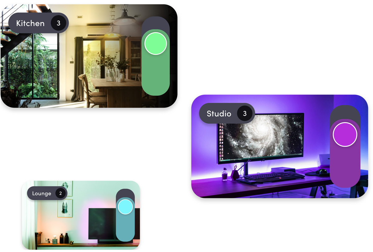
Groups
Control your whole home or groups with the tap of a button, and tap the card to access individual lights inside those groups. App 4 now lets you control the brightness of a group directly from the Dashboard by sliding the power button up or down.
“Groups are an important part of the architecture of your smart home for both conceptualizing your whole space, as well as being able to easily call on spaces with voice or through scheduled automations. LIFX products can each be assigned to one group, so we see these most often as spatial designations (most often, rooms). Adjusting the level of lighting in rooms is a frequently done task and one we wanted to bring up to the top level of interaction.”

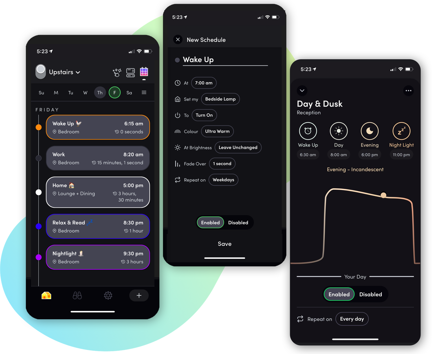
Scheduling
Schedules, including Day & Dusk, are now in one place, making it easy to browse, view and create. See the summary of your schedules in a simple weekly view, and pause/unpause as you wish. The new home of scheduling is giving light to a section of the app that was often left in the dark. Never worry about leaving the lights on again!
“Scheduling is one of the most important functions for people who invest in smart lighting. We know when users start to schedule, they start seeing how helpful smart lights can be. Scheduling can also help with security, energy saving, personal safety and convenience so we knew it was one of the most important areas of focus. In the research phase, the design team looked at current user behavior on our previous app and we could see that schedules were something that were getting a lot of mileage from what we call ‘power users’, but were often completely missed by other types of users. We needed them to be discoverable and understandable to users who hadn’t been using them yet. We also wanted to also make them more useful to current users who love them, with visualization that was both familiar and gave at-a-glance confirmation of what happening in your home on any given day. The work on Schedules is one of our proudest design improvements to be released to you in App 4.”
Effects
Not only have we moved scheduling to a more directly accessible part of the app, but we’ve also taken a fresh look at how effects should be applied. Instead of needing to go into each light, or group and open an array of doors to apply the desired effect, simply swipe to the left from the dashboard and apply an effect directly.
We don’t want to give too much away, but our goal was to create a great foundation that will only become more convenient in the future.
“Giving effects its own home, along with scenes, was something we felt was a big step from our previous experience in terms of the design architecture. We knew this would be a contentious one, given that effects has always lived deeper in an individual light. Much like schedules, we found many users were not finding these features or would use effects with higher frequency at the very beginning, then find it more involved than they wanted to just trigger on a whim.
We wanted to create a space for ‘play’ and ambience across spaces. When your friends show up for drinks, you hit the music visualizer that you used last week on your living room and it just works. your dinner scene for a romantic little setup you’ve got going on is ready and waiting and you can also layer on a candle flicker. We wanted to encourage these two features to be used in layers more, and our future design and development will be looking at this specific area of the app to add a lot more power and blended functionality.”

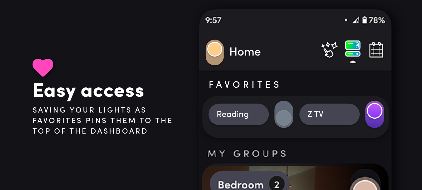
Make the most of Favorites
Use favorites for even easier access to the lights, scenes and effects you need to the most. If you have many groups, you can add them to favorites via the love heart icon to place them all in an easy to control layout. If set up correctly, there is seldom a need to control individual lights.
“We knew favorites were a crucial part of the ease of use for customers, for both pulling frequently used lights and groups to the top. This we kept much the same but looked at tuning the intuitive aspect of the design to bring in the iconic ‘heart favorite’. ”
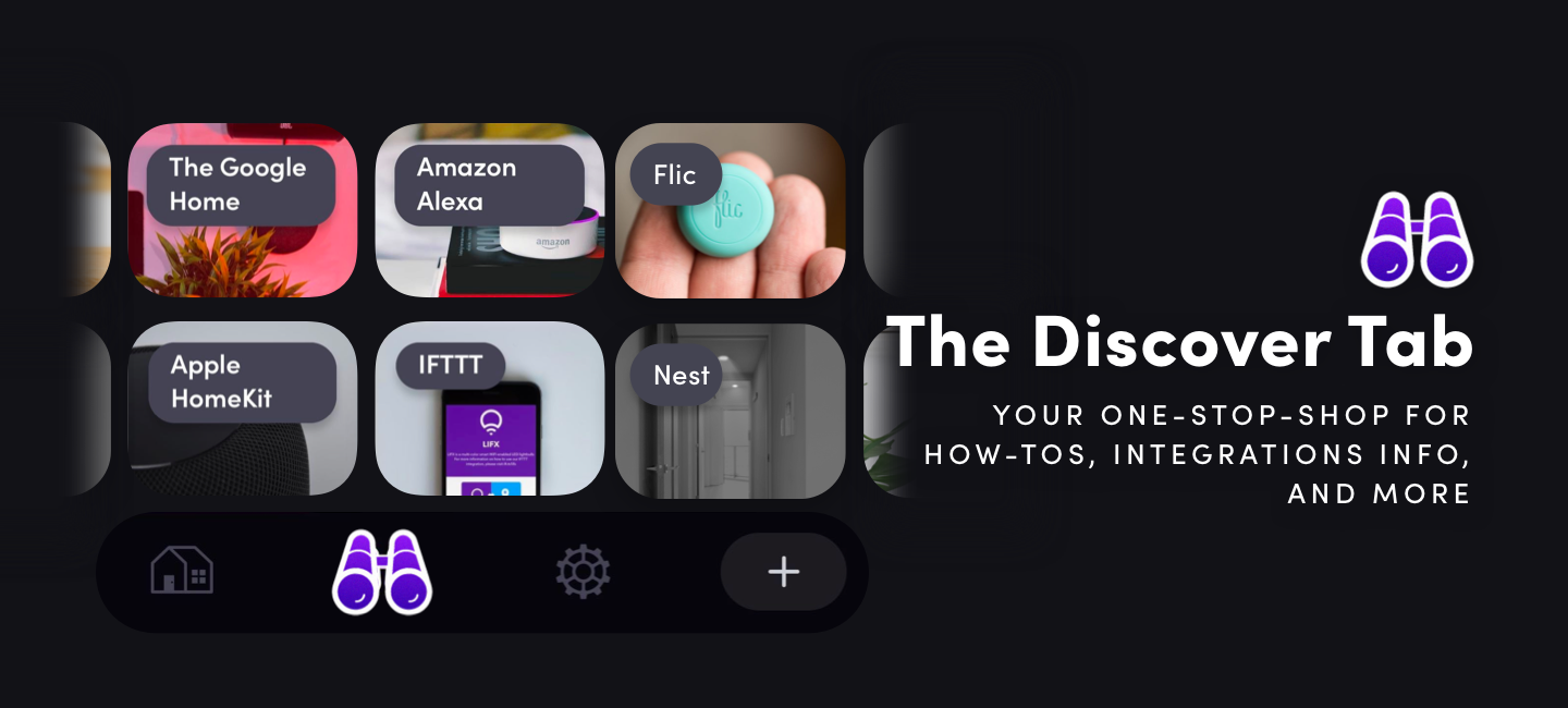
Discover Tab
Support articles, integration directories and the LIFX Store all have a new home within the app. Navigate to the Discover Tab for easy access to a range of helpful resources. We will also run promotions from here, so be sure to check-in when you’re looking to upgrade the rest of your home!
“Listening to the feedback from our users on the previous app, we wanted to contextualize different types of app use into different spaces. The Home area is to keep all of the daily control views together at the fingertips of the user, so we broke out the Discover area to bring together information about how to get more out of your lights, integration information and set-ups and the broader smart home context in one place.”
Personalize
Everyone’s home is different, so it wouldn’t make sense for us to limit how your home is represented in our new app. Now, from the Group Settings, you can upload an image of your home, or group to best represent what it actually is. The sky is the limit here. We’ve included a bunch of pre-set images too, including a set of custom illustrations made for LIFX especially by our friend Bonnie Eichelberger (in fact, she did all of the illustrative elements of our new UI). [@bonnieeeichelberger /
www.bonnieeeichelberger.com].
“When thinking about a dashboard for users to visualize their home, what we wanted most of all was to create a space that could be unique to each person. We wanted our users to be able to show their home in any way they felt was most useful and sentimental to them. We worked with Bonnie to create the illustration set for groups to ensure there was an iconic out of the box experience that brought a little sense of human and a larger sense of home to the smart home tech space. Bonnie’s a Melbourne girl like me and it was an amazing experience to work so closely on such a significant project for our brand with her. We’ve been fans of her work for a few years now and we really wanted to collaborate with an artist on this project to create something bespoke and unique for our users — plus she’s a major LIFX fan so it was a labor of love for her too.
If you love the illustrations let us / her know. We are also happy to create more in future to help people visualize their homes in new ways!
We’re really excited to see all the wacky and wonderful ways our users find to create their own styles and artwork — share those too! We’re really hoping to collaborate with more artists, illustrators and designers to make different set styles so we’d also love to hear from anyone keen to collaborate in future.”
Got Feedback?
As with any significant redesign of an app — like this — the lost familiarity can be a little disarming. As Garth from Wayne’s World rightly points out, “We fear change”. But please, fear not. To assist with the transition, we’ve put some articles here, myriad how-to videos, and a feedback form, so you can propose updates in future versions (or vent — we understand).